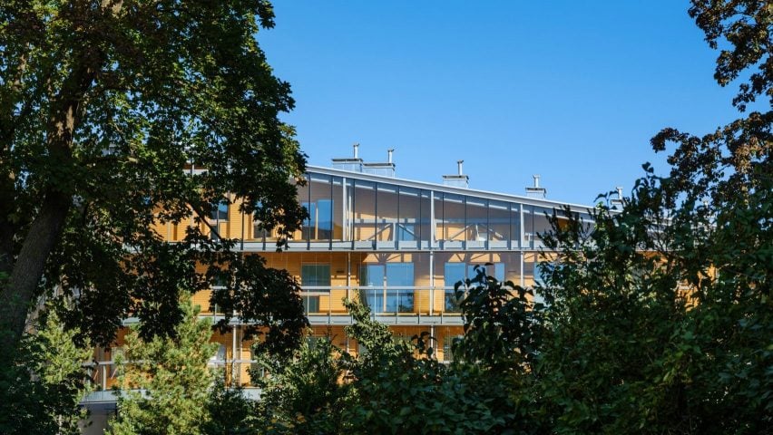
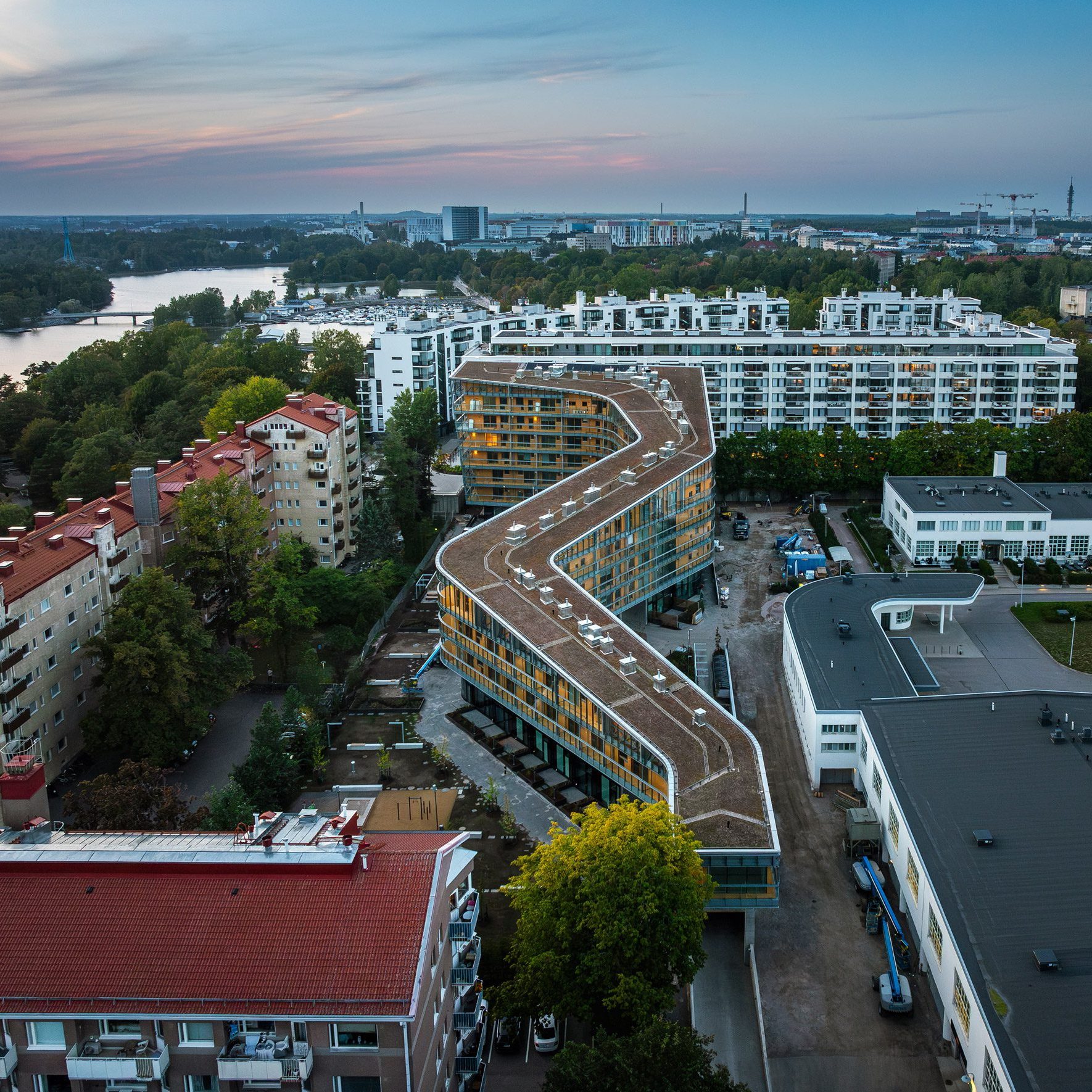
In this week’s comments update, readers are discussing a housing project with a snaking form called Meander, completed by US studio Steven Holl Architects in Helsinki, Finland.
The 180-metre-long housing project comprises 115 unique apartments across eight floors, with a curved concrete structure lined with wood and glazing, framing views of a series of open outdoor areas.

“Refreshing and simply put, a beautiful project”
Commenters were torn.
Andy Brackstone wasn’t fully sold, writing “looks great but, with the number of apartments to recreational space ratio, I thought the roof was crying out to be better utilised”. They suggested the addition of a “skateboard park or running track plus tree planting to compensate for the grass roof”.
“It looks like a 1940s seaside motel,” said T Foxe.
However, Franky four fingers was less despondent, granting “this is honestly far nicer and more interesting than just about any multi-family residential building that is built in the US.
“Refreshing and simply put a beautiful project,” praised Sorperdida. “Holl is showing again his mastery of residential housing, being also responsive to context and local tradition with collective living,” they added.
Which camp are you in? Join the discussion ›

“Looks like a bunch of construction trailers screwed together”
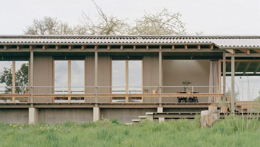
Another project that readers struggled to reach a consensus on this week was a timber house informed by agricultural architecture that architect Roman Morschett nestled into a grass-filled orchard site in rural, southwest Germany.
Orangikaupapa described it as “serene, sober, elegant”, before reflecting that “it sits with no ego”. Meanwhile, Dik Coates simply thought it was a “lovely timber construction”.
The Discreet Architect was less keen, writing “the floor plan for this house is well resolved but overall the execution is a little bland for my tastes”.
Souji agreed and felt “this is really nice, but it feels a bit lacking, empty, especially the interiors”.
Far less forgiving was Apsco Radiales, exclaiming “dreadful proportions!” before determining that it “looks like a bunch of construction trailers screwed together”.
Elegant or bland? Join the discussion ›

“You would have to be drunk to think that is going to help the environment”
Readers reacted to the news that beverage company Diageo has produced the “world’s lightest” standard-sized glass spirits bottle for its Johnnie Walker Blue Label Ultra whisky. The special edition bottle weighs just 180 grams and stands in a protective bamboo “cage”, made in a quest to reduce the carbon emissions from packaging.
Commenters were far from convinced of the logic. “So they go from a familiar glass bottle to a bottle that cannot stand on its own, requires a wooden cradle/roll cage and is marketed in two boxes,” said Bobinrsi. “You would have to be drunk to think that is going to help the environment,” they concluded.
“An upper-class novelty?” asked Idracula. “A container that can’t stand alone requiring a wood prosthesis to exist – rates an F!”
The Discreet Architect was similarly cynical, proposing “by my calculation: 320 grams less weight per bottle x 0.5 grams of carbon saved x 888 bottles = F-all carbon saved.”
“Pure marketing BS – would have been better to plant a few trees,” they concluded.
One of the only commenters to admire the design was Tim Smallwood, who enthused about how “it’s a contemporary take on an amphora – I think it’s terrific and I want one”.
What do you reckon? Join the discussion ›
Comments Update
Dezeen is the world’s most commented architecture and design magazine, receiving thousands of comments each month from readers. Keep up to date on the latest discussions on our comments page and subscribe to our weekly Debate newsletter, where we feature the best reader comments from stories in the last seven days.

